
Managing sections — add, reorder, duplicate, delete
Everything about sections: what they are, how to add them in the right position, reorder by dragging, duplicate, delete, and change their visual style.
In this guide
What is a section?
Your website is built from sections — self-contained blocks of HTML and CSS that stack vertically to form a page. Each section has a type (hero, about, services, contact, etc.) and its own content.
Sections are independent: editing or deleting one never affects the others. You can have as many sections as you like on a single page.
The section list (Sections tab)
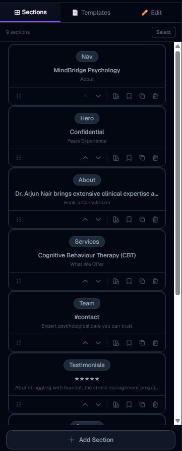
The Sections tab in the left panel shows all sections on the current page, in order from top to bottom. Each row shows:
Click any row to select that section and jump to its Edit tab. The selected section is also highlighted in the live preview with a colored border.
Reordering sections by dragging
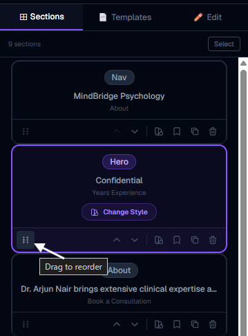
To change the order of sections, drag a row in the left panel up or down. Grab anywhere on the row and drag — a dashed placeholder shows where it will land. Release to drop.
Alternatively, you can use the up/down arrow buttons that appear when you hover over a section row (visible on the right side of the row). These move the section one position at a time without dragging.
The live preview updates immediately when you reorder.
Inserting a section at a specific position
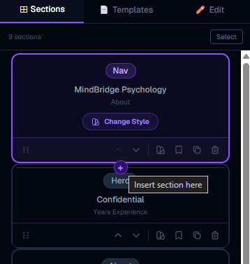
You do not have to always add sections at the bottom. To insert between two existing sections:
This is useful when you already have a footer at the bottom and want to insert content above it without manually moving things.
Adding a new section (type picker)
Click + Add Section at the bottom of the section list (or the + between sections). This opens the section type picker — a 2-column grid of 21 available types:
hero · nav · about · services · features · image + text · gallery · testimonials · team · stats · pricing · faq · contact · booking · newsletter · CTA banner · blog preview · products · social links · map · footer
Click any type to open the variant picker for that type — showing different visual designs you can choose from. Pick a variant and the section is added to your page instantly, pre-filled with your business name and details.
At the bottom of the type picker there is also a "Generate with AI instead" shortcut, which opens the AI drawer with that section type pre-suggested.
Section actions: duplicate, delete, change style, save as template
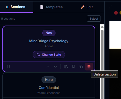
Hover over any section row in the list to reveal four action buttons on the right:
Duplicate (copy icon) — creates an exact copy of the section directly below it. Useful for repeating a layout (e.g. two services sections with different content).
Delete (trash icon) — removes the section immediately. A brief toast notification confirms the deletion. There is no undo for deletion beyond the in-session undo stack (Ctrl+Z).
Change Style (palette icon) — opens the variant picker for the current section type. Switch to a completely different visual layout while keeping the same content. The picker shows your saved personal templates at the top, then all built-in variants below.
Save as Template (bookmark icon) — saves this section's current design and content as a personal template in your account. You can apply saved templates to any site you own in the future.
Section types — what each one is for
Hero — the main banner at the top of the page. Bold headline, subtext, CTA button. Most pages start with this.
Nav — the navigation bar. Logo on the left, page links on the right.
About — your story, mission, or "who we are" section. Often has a photo and text side by side.
Services — a 3-card grid of what you offer, with icons and descriptions.
Features — "Why choose us" — 3 highlighted points or capabilities.
Image + Text — flexible split layout: image on one side, text on the other.
Gallery — a photo grid for showcasing work, products, or spaces.
Testimonials — 3 customer review cards with star ratings and names.
Team — headshots and names of your staff or founders.
Stats — large numbers (e.g. "500+ clients", "10 years experience").
Pricing — 3 pricing plan cards with features and a CTA button.
FAQ — accordion list of 3–5 questions and answers.
Contact — a contact form that emails you and saves to your dashboard. Can include WhatsApp button.
Booking — an appointment scheduling embed or call-to-action.
Newsletter — email signup strip.
CTA Banner — a bold full-width call-to-action strip, usually placed before the footer.
Blog Preview — a 3-card grid of your latest blog posts with Read More links.
Products — live product grid that loads items from your store.
Social Links — icons linking to your social media profiles.
Map — location embed or directions.
Footer — business name, copyright, and navigation links. Goes at the very bottom.
More in Builder
Builder layout and the top bar
Understand the full builder layout — the three panels, every top-bar button, the save system, and how to navigate pages.
Editing content — the Edit tab
How to edit text, buttons, links, colors, images, icons, and every other field in the content editor.
The AI Build & Edit drawer
How the AI chat works — generating new sections, redesigning existing ones, choosing models, using reference images, and understanding AI credits.
Media library, logo, fonts, and hero images
How to upload images and logos to the media library, set your site logo, choose fonts, and set a hero background image or video.
Power features — select mode, batch redesign, templates, shortcuts
Advanced builder techniques: select multiple sections for batch AI redesign, save custom section templates, use keyboard shortcuts, and apply full-site templates.
Managing pages in your website
How to add new pages, switch between pages, navigate internal links, and delete pages you no longer need.
Using templates smartly — get more with fewer AI credits
How to build a complete, professional website using ready-made templates without spending any AI credits — then use AI only where it matters most.
Empty Section — build any custom layout with AI or your own code
How to add a blank empty section to your page and use the AI drawer or Code Editor to turn it into any layout you can imagine — no templates, no limits.
Section Creator — build and save custom HTML/CSS sections
How to write your own HTML and CSS in the Section Creator, add editable fields with data attributes, run the AI security check, and reuse your sections across all your websites.
Section Creator — coding rules & what JavaScript is allowed
Understand exactly what HTML, CSS, and JavaScript you can use in the Section Creator — including how to write interactive components like menus, accordions, and animations correctly.
Creating new pages with AI — the complete guide
How to use the AI assistant to create full pages with sections and automatic nav wiring — including model choice, credit costs, and what to expect.
AI Assistant tips and tricks — get better results faster
Practical techniques for getting the most from the AI assistant — quick prompts, the right mode for the right job, how to save credits, and what the AI can actually do.
Save as My Template — reuse sections across all pages
How to save any section as a personal template and reuse it on any page or any website — the fastest way to keep your site consistent.